NHS Digital Staff Passport
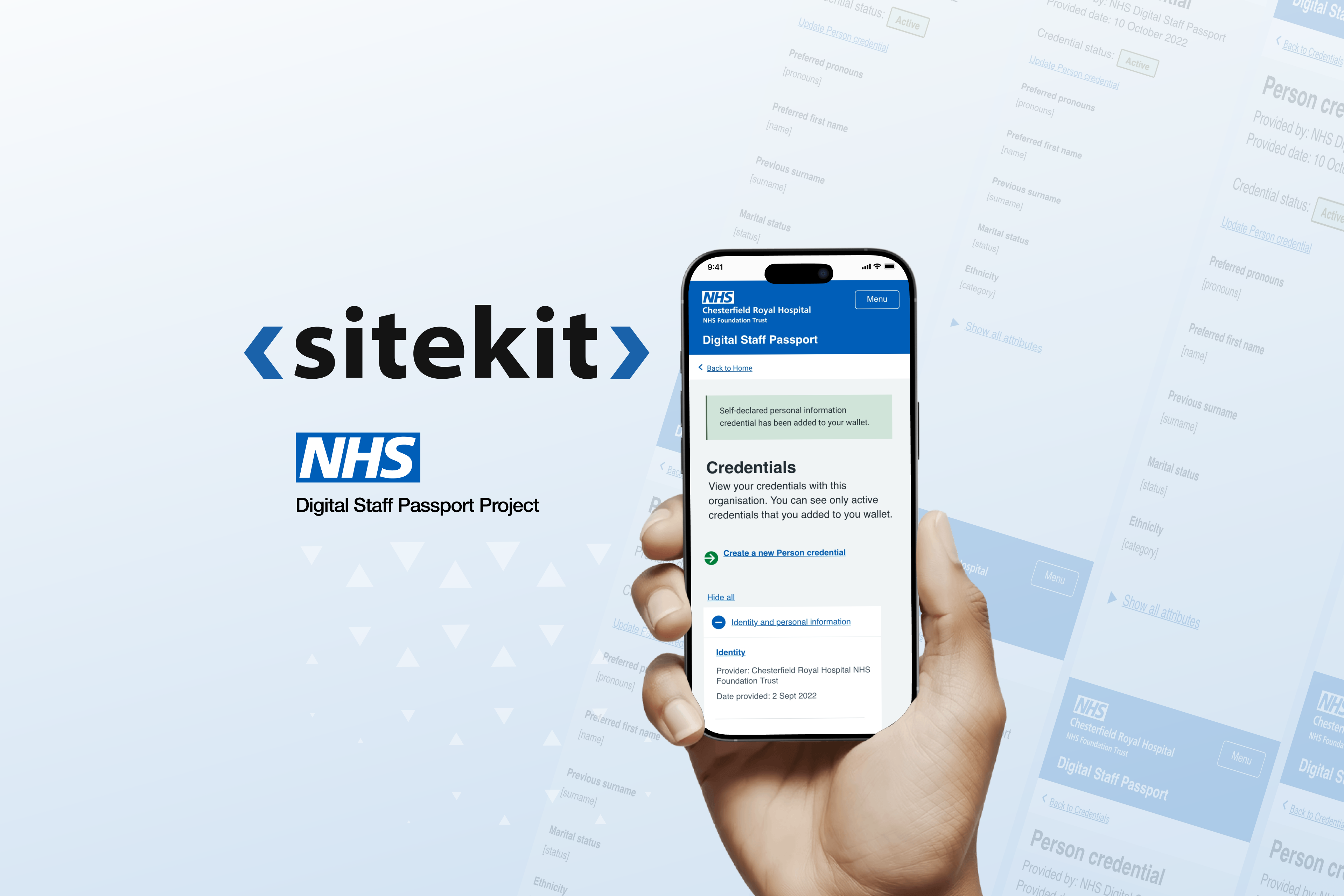
CHALLANGE
On the surface it looked like an efficiency problem. Underneath, it was about trust.
People were being asked to share verified credentials and personal data, and to rely on a system to vouch for who they were. That only works if users feel safe at every step, and if the organisations receiving them believe the verification is watertight. So the brief wasn't really "make onboarding faster." It was: how do you make a secure, regulated identity journey feel clear and reassuring at exactly the moments where people tend to hesitate or drop off?
objectives
- A usable, trustworthy verified-credential experience.
- Full alignment with NHS Design Standards and WCAG 2.1 AA.
- Buy-in across a wide, cautious stakeholder group.
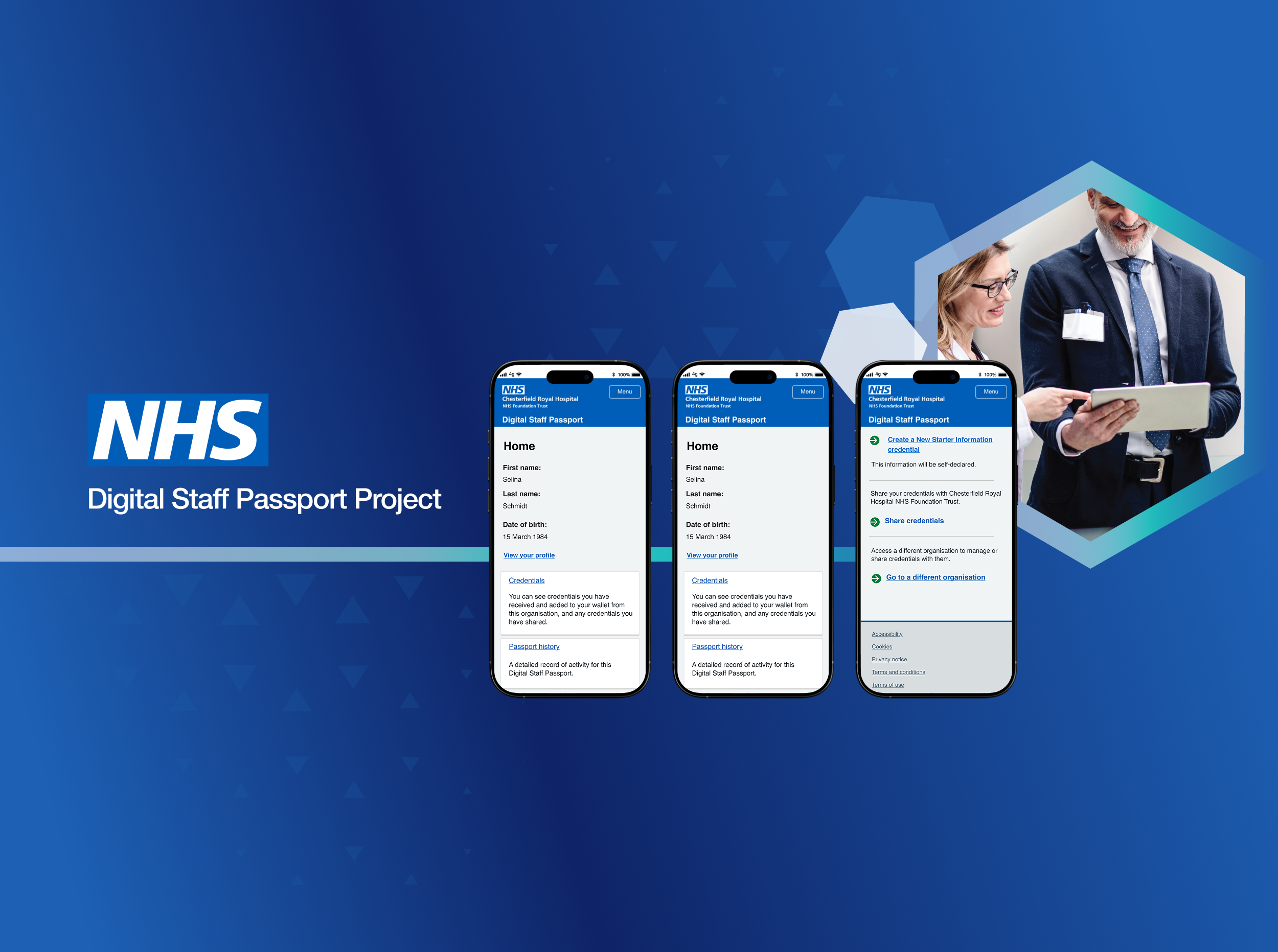
Approach
I worked end to end, and I leaned hard on the people who knew the constraints I didn't.
I started in discovery, mapping the real journeys and the regulatory guardrails: what had to be verified, what couldn't be skipped, where the requirements were simply non-negotiable. I ran this alongside clinical, operational and technology stakeholders rather than designing in a vacuum, so the constraints shaped the work from day one instead of surfacing late.
From there I mapped the full end-to-end flow and marked the nervous moments, identity confirmation, consent, sharing data with a new organisation. Those points became the focus of the work. I designed flows, accessible UI components and interactive prototypes in Figma, presented to stakeholders through the cycle, and refined as feedback came in. Throughout, I worked directly with engineers to keep everything buildable within the platform's constraints rather than designing something that looked good but couldn't ship.
key decisions
A few choices shaped how the product actually felt to use.
I led with plain language at every sensitive step. At identity confirmation and consent, I chose to spell out what was happening, why, and what came next, rather than relying on legal or system phrasing. In a trust-critical journey, clarity does more to reassure people than polish.
I made progress visible throughout. Because the journey touched anxious moments, I kept a clear sense of "where you are and how far's left" front and centre, so nobody felt lost or unsure whether they'd done something wrong.
I designed error handling to help, not blame. Errors in identity flows are exactly where people give up, so I treated every error state as a guidance moment: what went wrong, and the clear next step to fix it.
I treated WCAG 2.1 AA as the starting point, not a final audit. Contrast, focus states, screen-reader-friendly flows and resilient components were designed in from the first sketch. In a service that has to work for every member of staff on any device, accessibility was the floor, not a feature.
I prioritised the receiving organisation's trust as much as the user's. The journey had to reassure the person sharing their identity and give the organisation on the other end confidence the verification was watertight. Designing for both sides of that trust equation drove a lot of the structural choices.